Render Dashboard
Render Dashboard
The modern cloud provider for all your apps and websites.
The modern cloud provider for all your apps and websites.
The modern cloud provider for all your apps and websites.
This case study showcases my approach after beginning my work with Render as a contractor, where my goals were to audit the existing web application, enhance its visual language, and create a documented design system. The overall objective was to improve the user experience and design consistency of the application, and allow for quicker work flows within design and engineering teams moving forward.
This case study showcases my approach after beginning my work with Render as a contractor, where my goals were to audit the existing web application, enhance its visual language, and create a documented design system. The overall objective was to improve the user experience and design consistency of the application, and allow for quicker work flows within design and engineering teams moving forward.
This case study showcases my approach after beginning my work with Render as a contractor, where my goals were to audit the existing web application, enhance its visual language, and create a documented design system. The overall objective was to improve the user experience and design consistency of the application, and allow for quicker work flows within design and engineering teams moving forward.
Role
Role
Design Lead
(Contractor)
Design Lead
(Contractor)
Services
Services
Visual Language
Design System
UI & UX Design
Visual Language
Design System
UI & UX Design
Collaborators
Collaborators
CEO, VP of Engineering,
Engineering, Marketing
CEO, Eng VP,
Engineering, Marketing
Date
Date
October 2021
October 2021



01. Visual Language
01. Visual Language
01. Visual Language
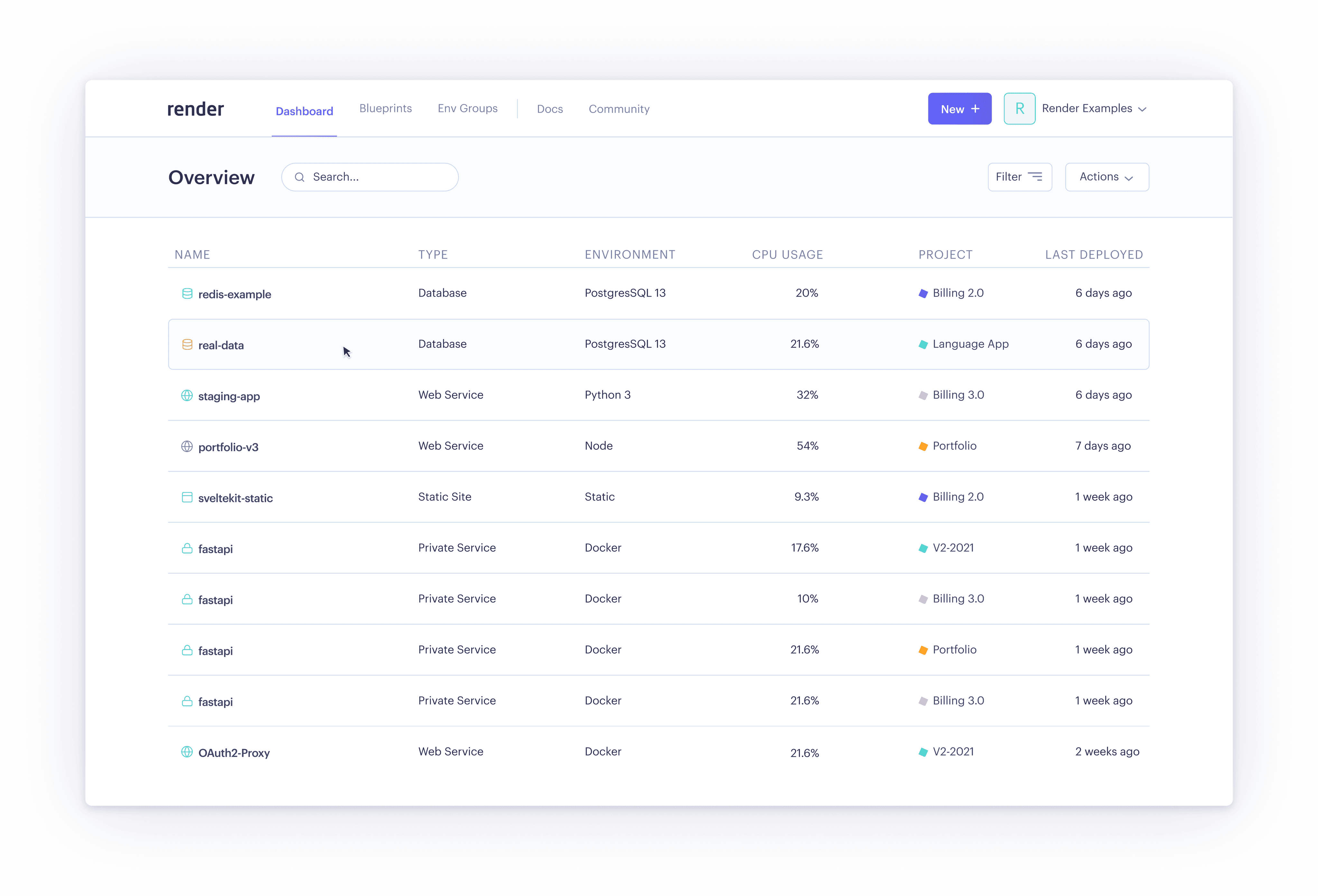
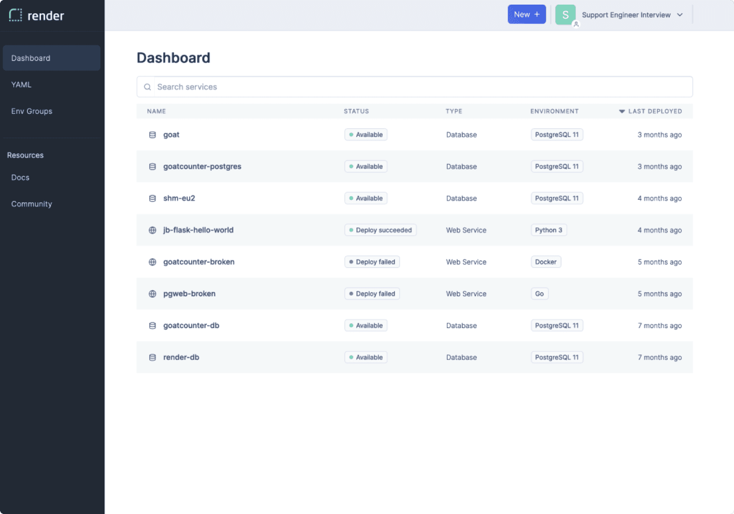
The CEO of Render made it clear during our intial conversations that he thought there was a lot of room for improvement within Render's dashboard. He wasn't satisfied with Render's visual language, which felt a bit bland, overly-coorperate, and didn't express the clean, polished, and friendly identity he wished for. The platform was built using a bootstrapped design system, so there was little intentionality behind the visual language, and there were many inconsistencies as new components were added and Render began to scale.
The CEO of Render made it clear during our intial conversations that he thought there was a lot of room for improvement within Render's dashboard. He wasn't satisfied with Render's visual language, which felt a bit bland, overly-coorperate, and didn't express the clean, polished, and friendly identity he wished for. The platform was built using a bootstrapped design system, so there was little intentionality behind the visual language, and there were many inconsistencies as new components were added and Render began to scale.
Original

Explorations
I explored a variety of visual language directions, touching upon aspects like typography, layout, UI element styling, iconography, and color. Iterating on these directions based on discussion with leadership enabled us to align on an improved concept for Render's user interface without sacrificing usability, and improving it when opportunities arose.
I explored a variety of visual language directions, touching upon aspects like typography, layout, UI element styling, iconography, and color. Iterating on these directions based on discussion with leadership enabled us to align on an improved concept for Render's user interface without sacrificing usability, and improving it when opportunities arose.
02. Interface Audit
02. Interface Audit
02. Interface Audit
Now that we had a set direction, I could work on applying this new visual language to the dashboard's existing components. During this time, I took the opportunity to audit the product and take note of any inconsistencies among the implemented components in use across the platform. None of the Render dashboard or the elements that comprised it were documented in Figma, so I built the screens and components from scratch.
Now that we had a set direction, I could work on applying this new visual language to the dashboard's existing components. During this time, I took the opportunity to audit the product and take note of any inconsistencies among the implemented components in use across the platform. None of the Render dashboard or the elements that comprised it were documented in Figma, so I built the screens and components from scratch.
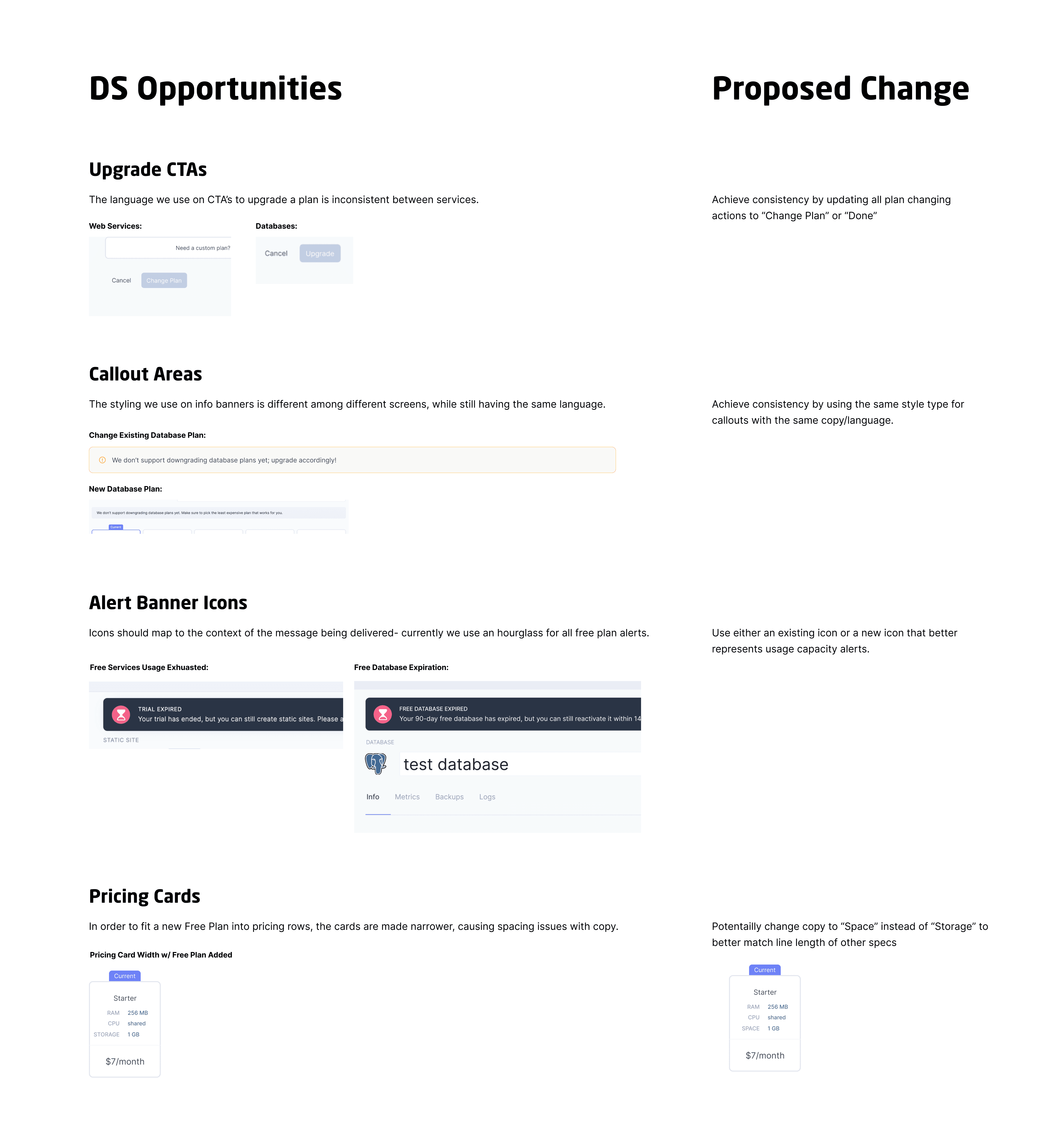

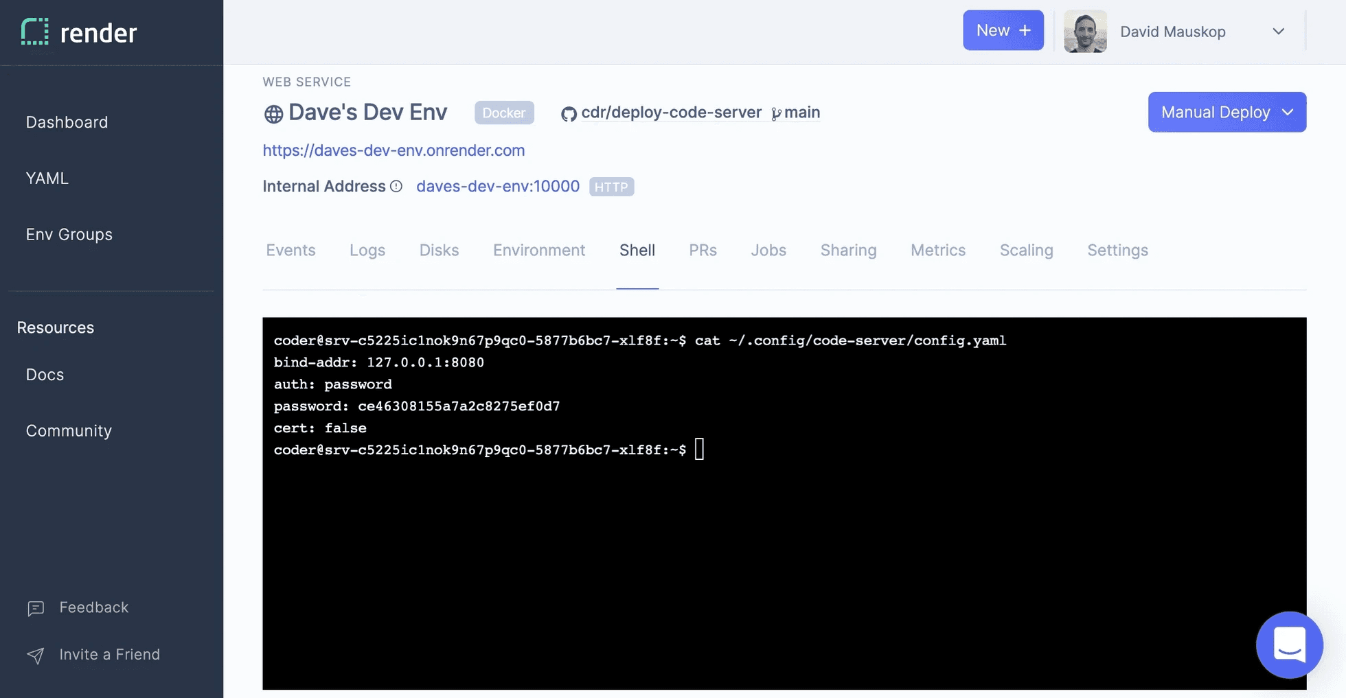

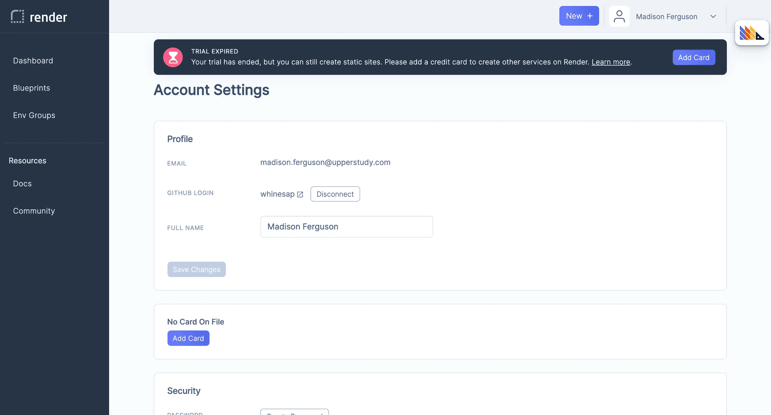

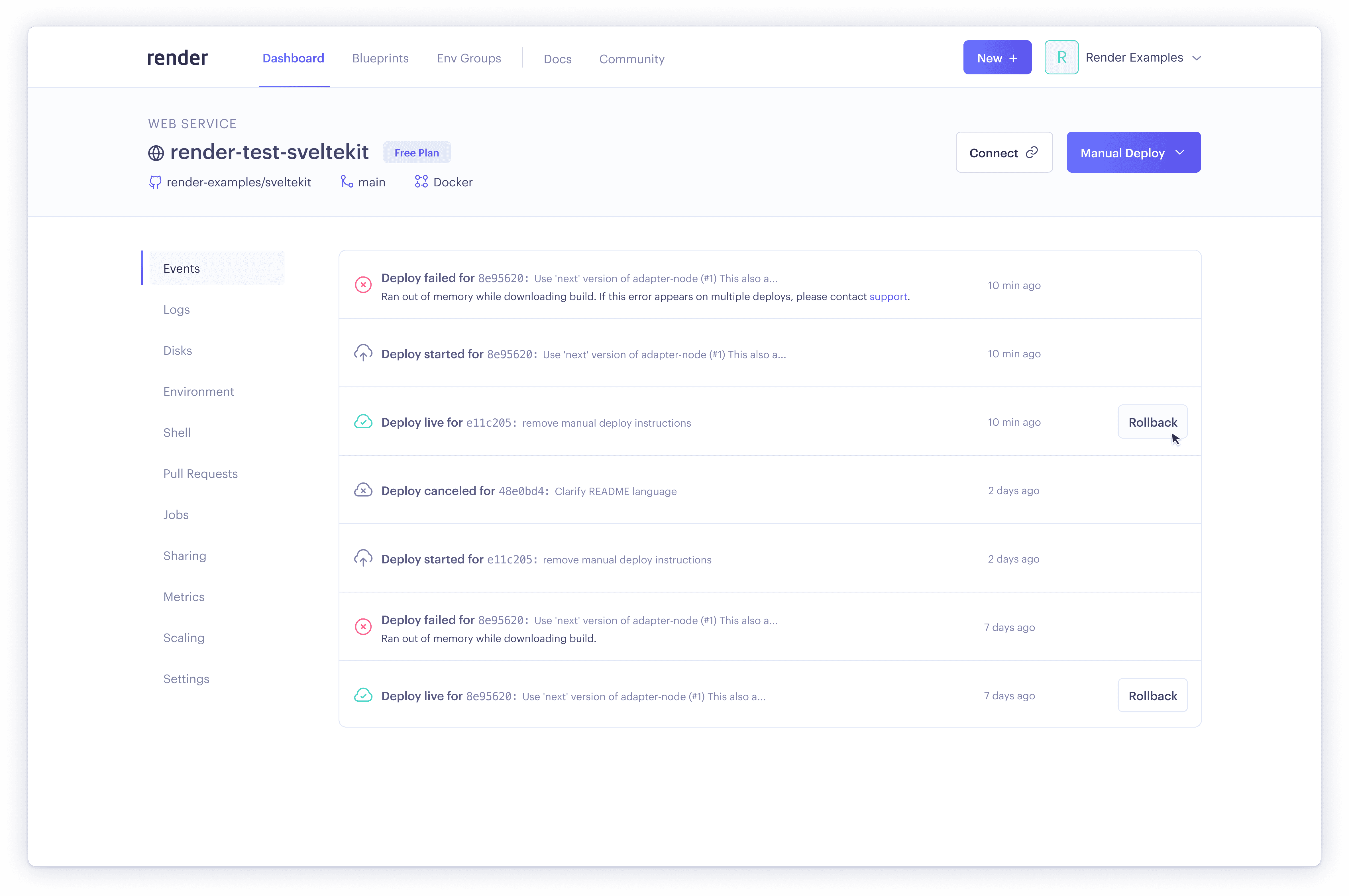
There were many points during product auditing where I came across aspects of the interface or information architecture that were in need of improvement. I designed solutions in line with our new visual language when time permitted, and took note of future work to be done if not.
There were many points during product auditing where I came across aspects of the interface or information architecture that were in need of improvement. I designed solutions in line with our new visual language when time permitted, and took note of future work to be done if not.

Before


Prototype
After
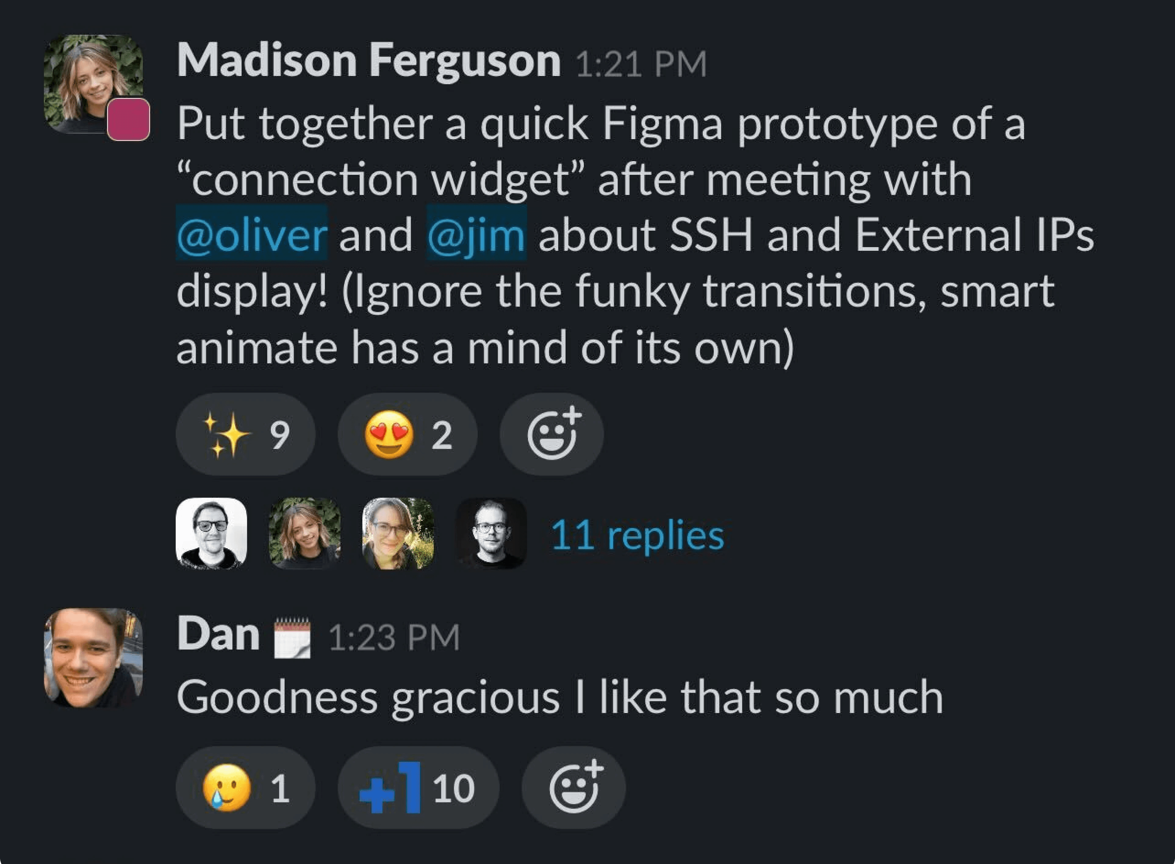
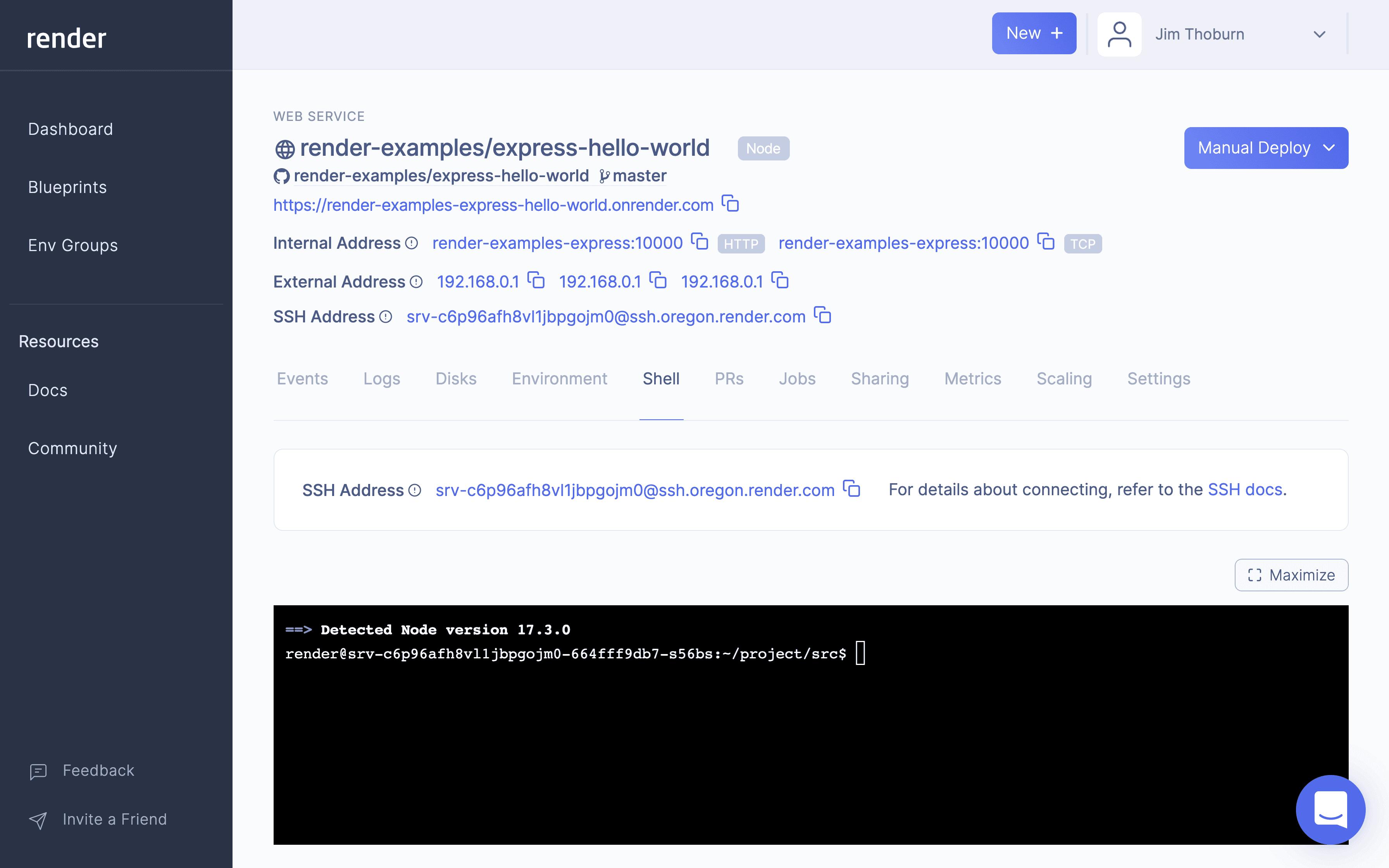
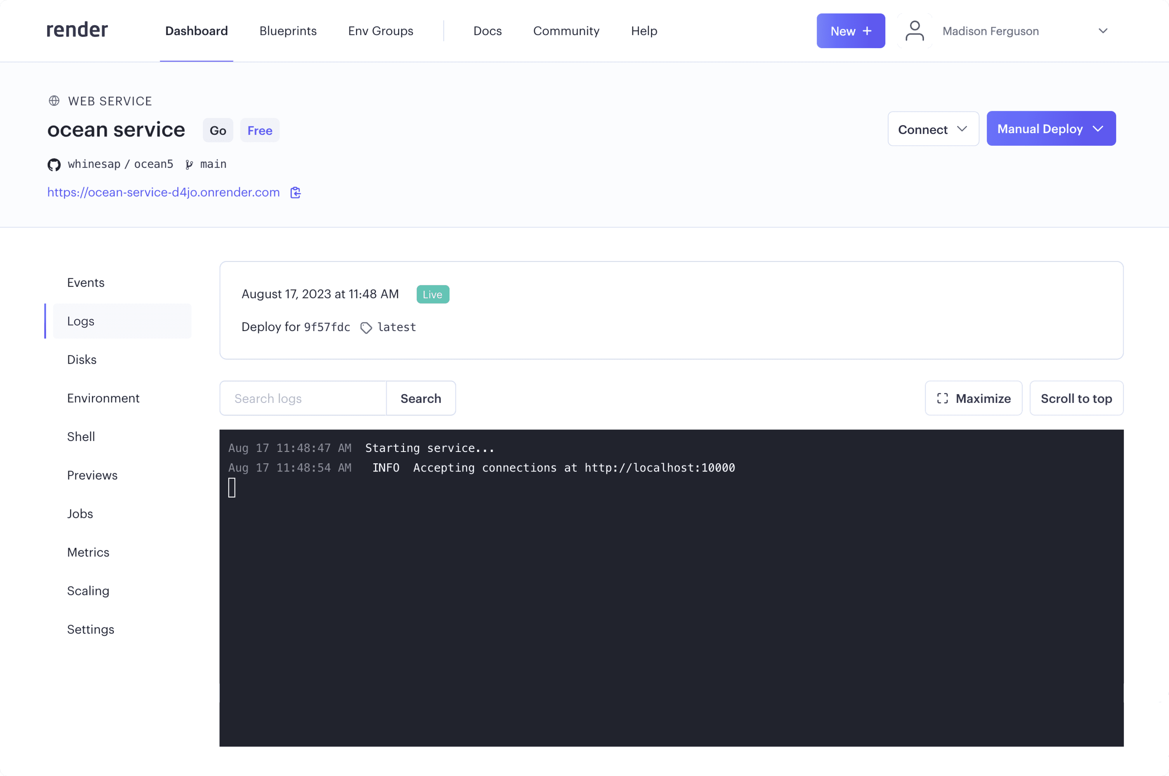
In this example, I was able to clean up a very cluttered service header by having discussions with engineers at Render about how each piece of information in the header fit into developer workflows. What was most important to see at all times? What could be displayed a different way depending on frequency of use?
I ended up creating a "Connection Widget" that housed the various addresses associated with a service, since these will only be used occasionally when configuring applications. This widget lived within the service header, with the addresses now out of direct sight, but just a click away.
03. Design System
03. Design System
03. Design System
By going through and building Render's components ands screens in Figma, applying the new visual language and making improvements along the way, I was able to build out the start of Render's first documented design system. This made it much easier to build new screens and create new components when needed, and when Render brought on a new designer we were able to both work from this unified system, making improvements and scaling it over time.
After some persuading I was able to get front-end engineering onboard with integrating Storybook into our workflow, which allowed us to be more efficient in design Q&A during testing and implementation of new features. As workloads increased and the design team had less time to maintain the design system in Figma, continuing to use Storybook as the main source of truth for design components kept our interface consistent and scalable.
Before


After


Prototype
